A website can tell you what a product does. A great website makes you understand why it matters. That was the thinking behind the new PitchPro website.
This wasn’t simply a redesign of colors, images, or layouts. We stepped back and asked a bigger question: If someone discovers PitchPro for the first time, does every part of the experience make the same promise? The answer shaped everything that came next. Every page was rebuilt around one belief: communication is a skill everyone should have the opportunity to develop, and getting better should be practical, measurable, and accessible.
The Homepage Starts With the Why
The new homepage opens with a simple idea: win every moment that matters. From there, it takes visitors through the PitchPro experience, from setting a goal and rehearsing in realistic situations, to understanding their communication intelligence, adding the human layer, delivering with confidence, and continuing to improve.
It also recognizes that everyone comes to PitchPro for a different reason. Whether you're an individual preparing for your next opportunity, a mentor helping others grow, or an organization building communication skills across a team, there is now a clear path designed around you.
And the next step is simple: start practicing with a 7-day trial or book a demo for your organization.
The Product Page Lets You Experience PitchPro
One of the biggest changes is that we didn't want visitors to simply read about PitchPro. We wanted them to experience it.
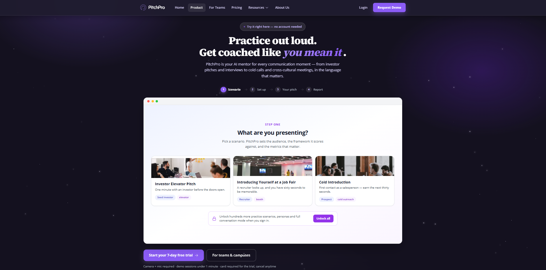
The new Product page introduces a live demo that anyone can try without creating an account. Choose a real-world scenario, an investor pitch, job fair introduction, or cold sales conversation, deliver it on camera, and receive feedback across content, delivery, and cultural fit. Instead of asking people to imagine what PitchPro could do for them, the website lets them see it for themselves.
The page also tackles a question we've heard before: Why not just use an AI chatbot? Because getting better at communication isn't about having one good conversation with AI. It's about practicing repeatedly, seeing your progress, understanding how you communicate, and knowing what to work on next. That's the difference between an AI conversation and an AI-powered communication coach.
For Teams, The Impact Becomes Visible
Communication development shouldn't stop with the individual. For teams, PitchPro now brings that same experience into a shared environment, with a live team dashboard, integrations, robust security and compliance infrastructure, and a customizable knowledge base.
Security is built into the way PitchPro supports organizations. We have a SOC 2 Type 2 report and ERM cyber insurance, giving companies greater confidence that their data and communication development programs are supported by strong operational and risk-management practices.
Leaders can see what's happening across their teams, understand where people are improving, and identify where more support is needed. We've also made the audiences we serve clearer: from universities and accelerators to sales teams, healthcare providers, and government organizations, PitchPro is designed for environments where communication can directly influence opportunity, performance, and outcomes.
Pricing Is About Access, Not Just Cost
We also wanted pricing to reflect what PitchPro stands for. The 7-day trial gives people the opportunity to experience the full product before making a commitment, while discounted student pricing and our permanent accessibility discount help make communication coaching available to people who might otherwise be left out.
For organizations, pricing is based on cohort size, so teams can invest according to their actual needs rather than fitting into a rigid, one-size-fits-all model. And because growth doesn't always have to be serious, there's even a little surprise: catch 100 falling stars and unlock 50% off your first month.
One Website. One Bigger Idea.
The most important thing about the redesign isn't any individual page. It's the connection between them. The homepage introduces the problem, the Product page lets you experience the solution, the team experience shows how growth can scale, pricing makes that growth more accessible, Resources help people keep learning, and About Us shows the people and purpose behind it all.
They're all telling the same story: PitchPro isn't a chatbot, a one-time workshop, or another training course that people forget about after a week. It's a way to practice, understand, measure, and continuously improve the way you communicate.
Because everyone has moments that matter, a pitch, an interview, a sales conversation, a presentation, a classroom, or a meeting. And everyone deserves the chance to walk into those moments feeling prepared.
That's the PitchPro we're building.
Before You Go
A redesign can make a website look better. But the real opportunity is to make it mean more.
This new website is a reflection of where PitchPro is going: from helping people practice communication to helping more people unlock the opportunities their communication can create.
We'd love for you to experience it yourself.